Sophias Sophias: Urban Bistro & City Garden
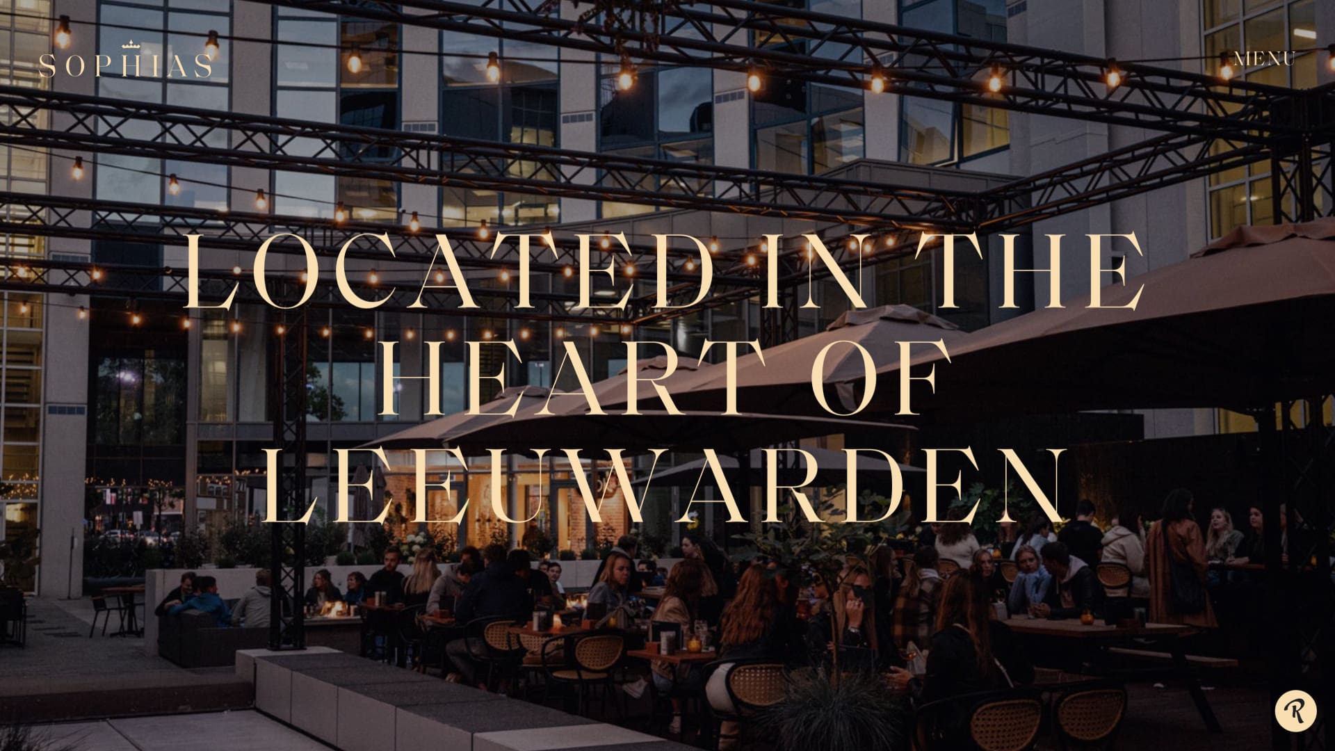
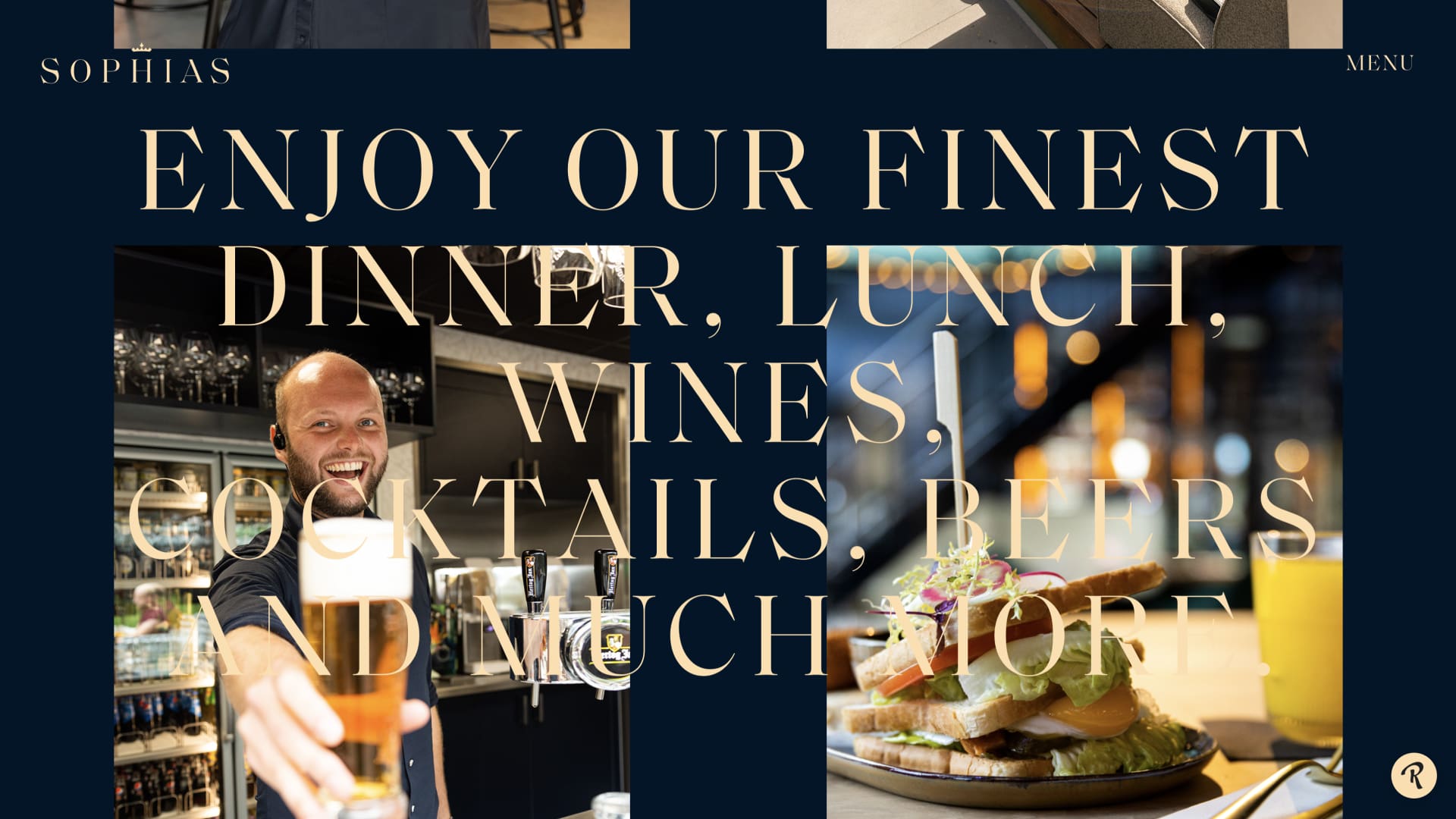
A catering concept with a royal touch, in the middle of Leeuwarden. Sophias is an all-day restaurant where you are welcome for snacks and drinks from early in the morning until late in the evening. We created the corporate identity and website, laid the foundation for the merchandise and facade advertising and contributed to the interior design.
The decisive ingredient
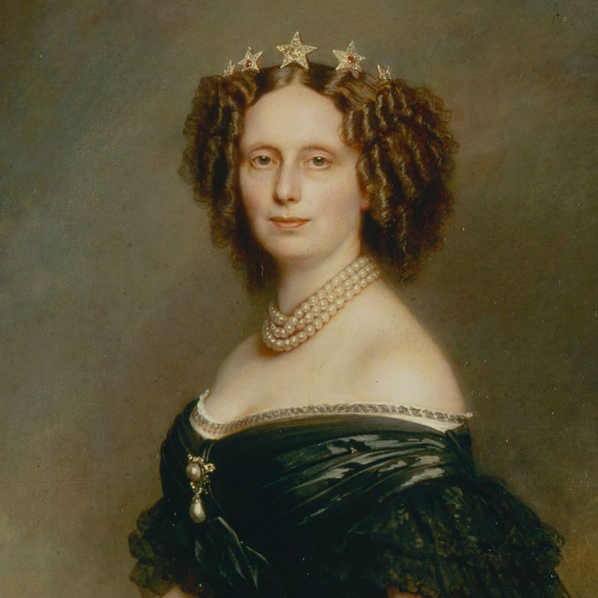
The starting point of our concept sessions? Coming up with a new catering concept for Leeuwarden. Luxurious, but also accessible. And an ‘Urban Bistro’ or ‘City Garden’, they didn’t have that in our town yet . A first! The name was quickly found. Sophias not only refers to Sophialaan, where the business is located, but is also a tribute to the former Majesty of the Netherlands, Sophia Frederika Mathilda. That local golden edge was the decisive ingredient in our challenge.
Royal room
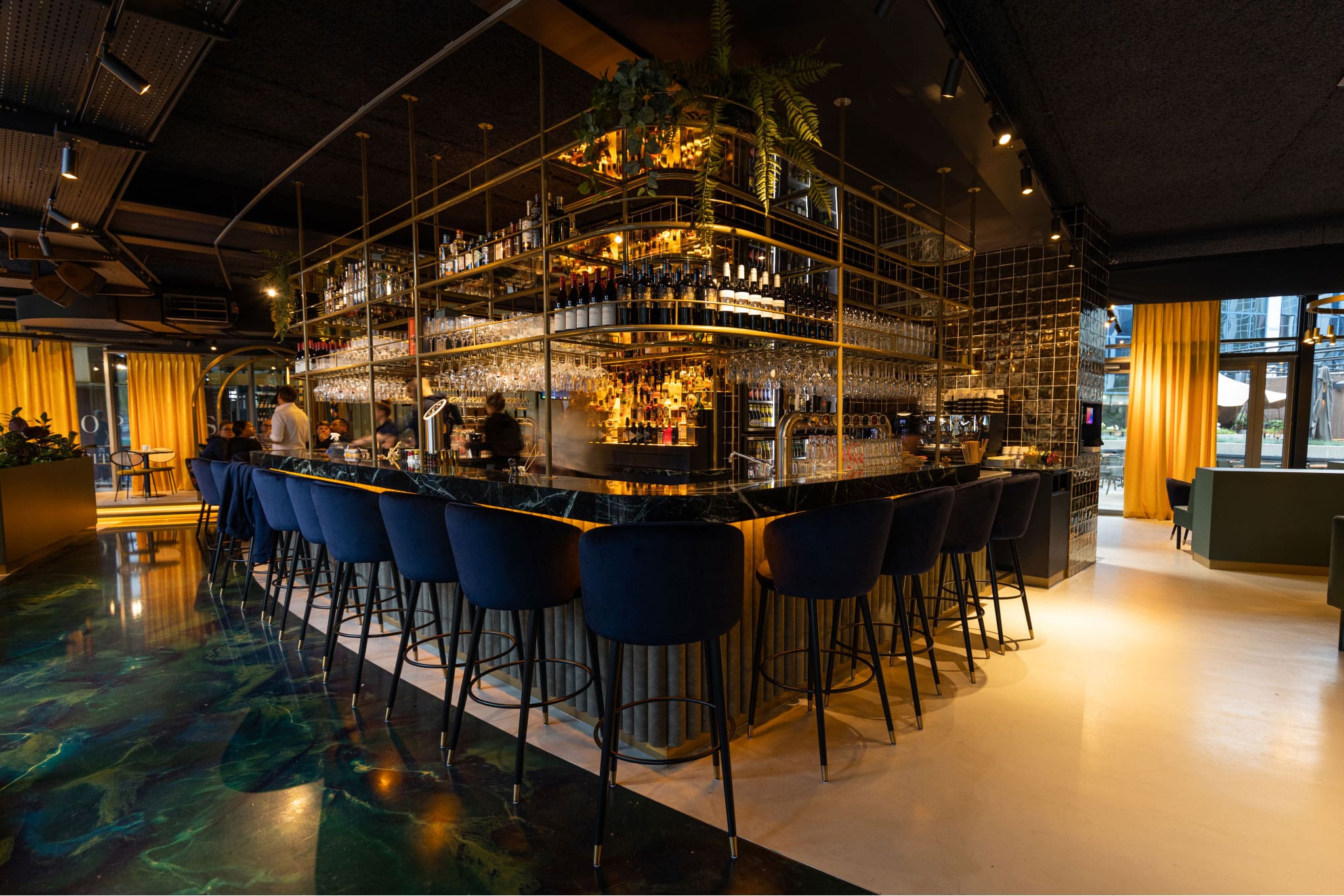
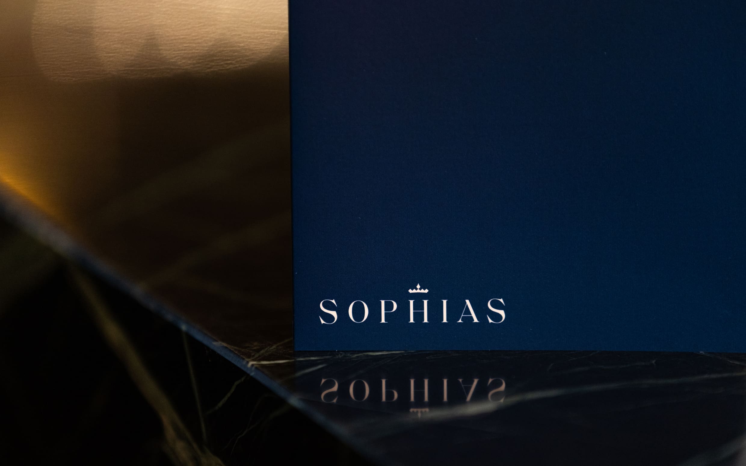
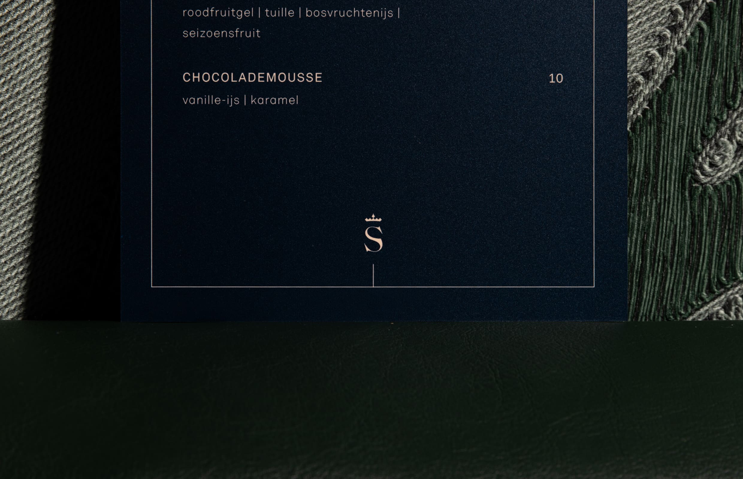
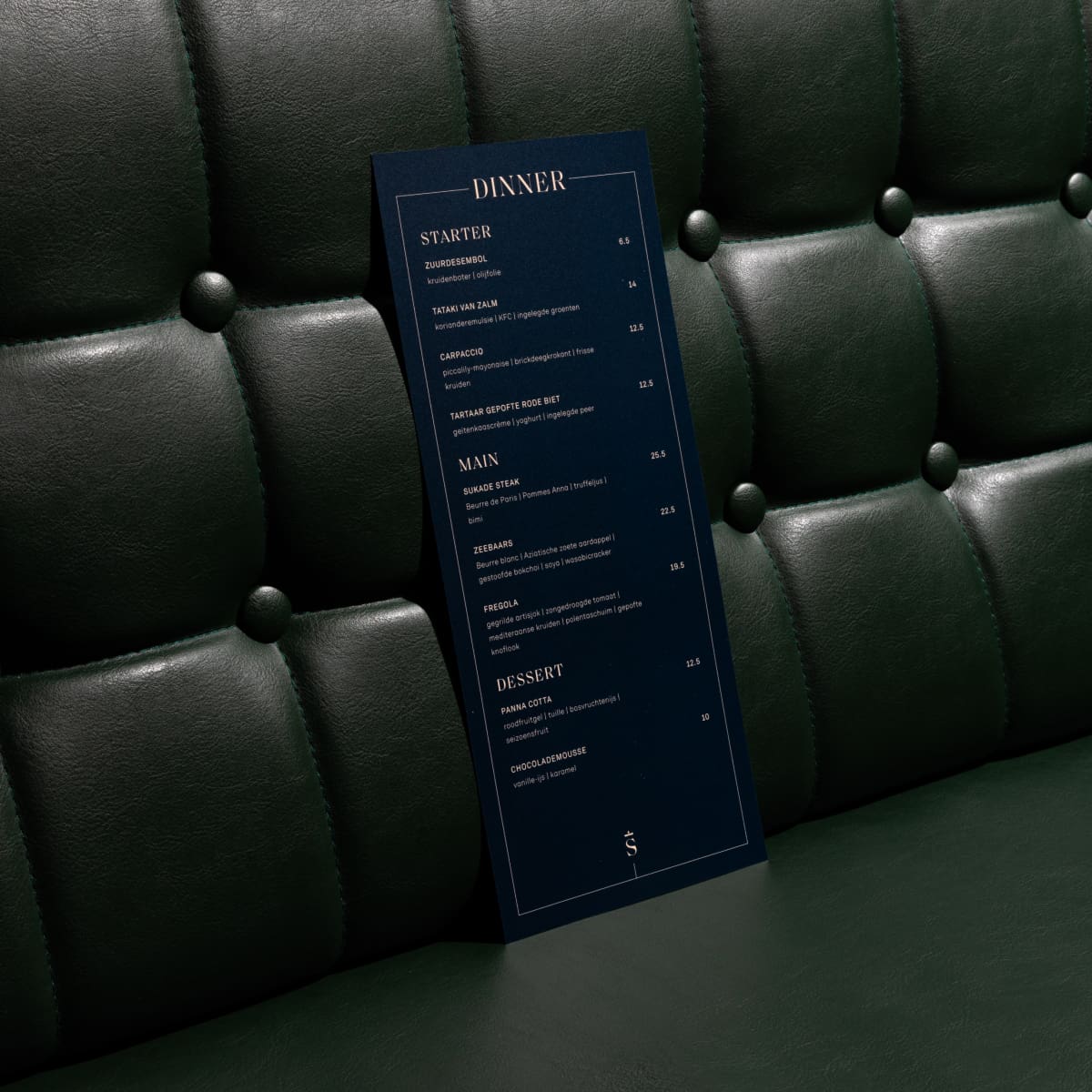
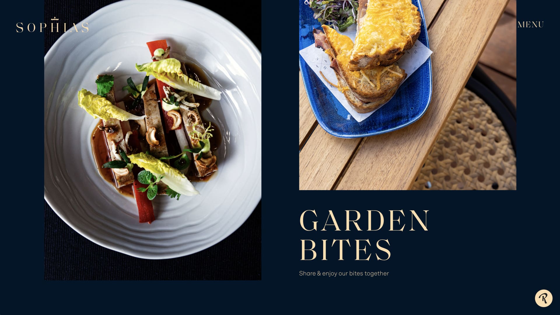
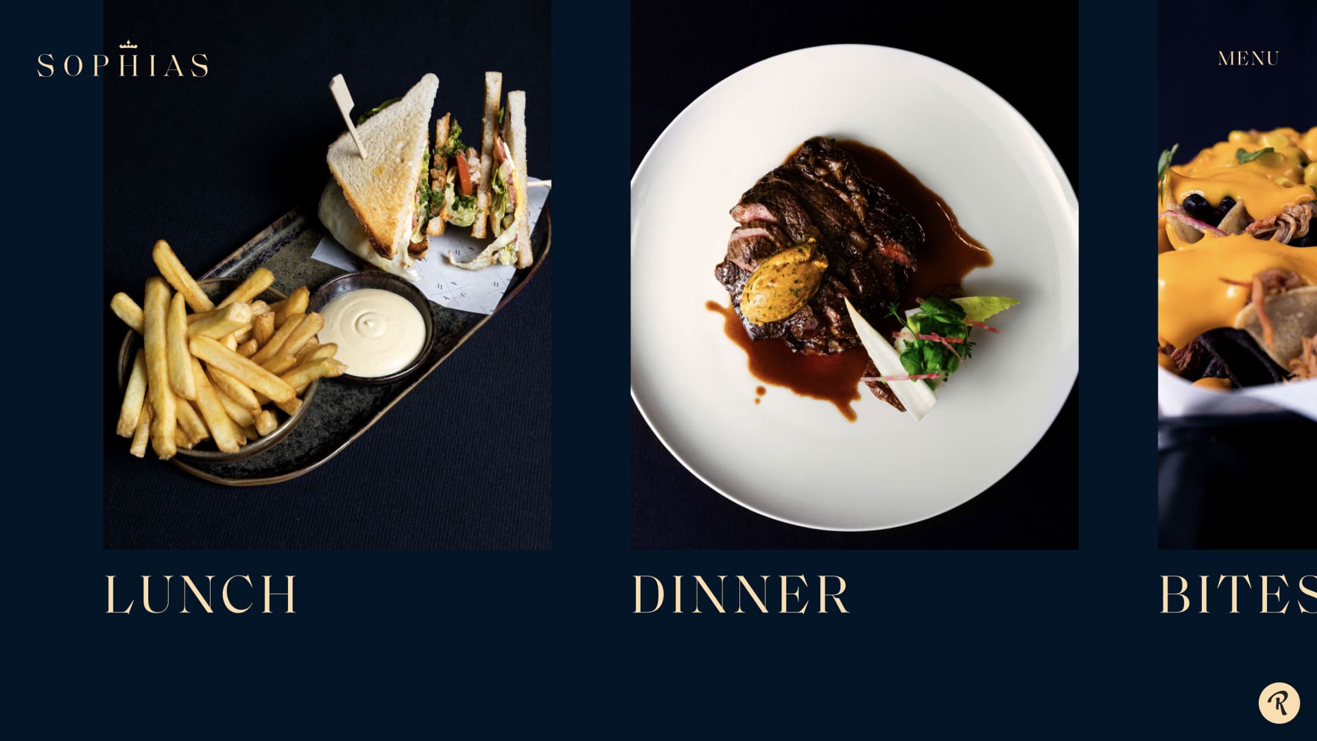
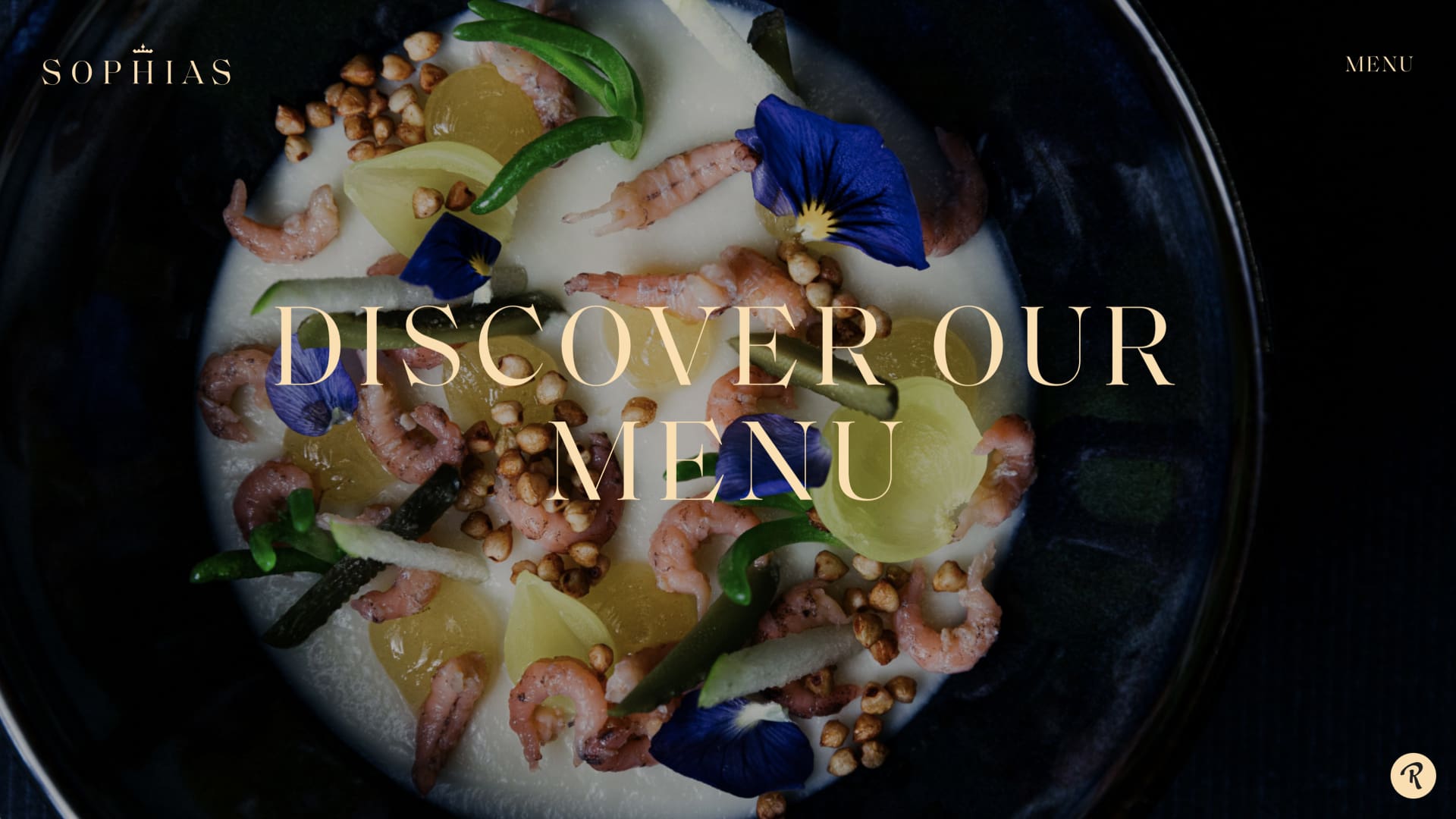
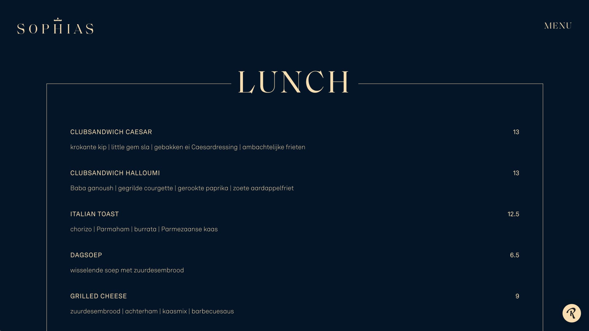
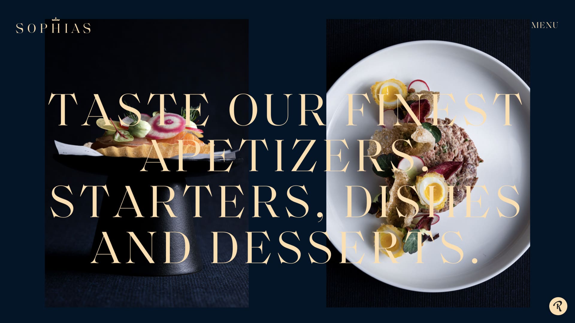
Her Majesty’s signature literally left a mark on the corporate identity. For example, the letter ‘-s’ and the crown are based on Sophia’s monogram. We combined this with the colors brass and royal blue, which in turn refers to the yellow and blue of Leeuwarden. Add the classic modern font with characteristic, intersecting points and you create a corporate identity with a ‘royal touch’ that fits seamlessly with the interior. The layout of the case also complies with the briefing. For example, you can dine in the Urban Bistro with smaller groups and the City Garden is a nice accessible place for a nice drink with family, friends or colleagues.
A generous welcome
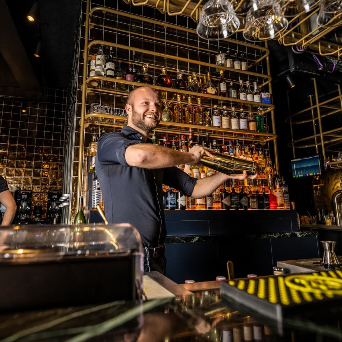
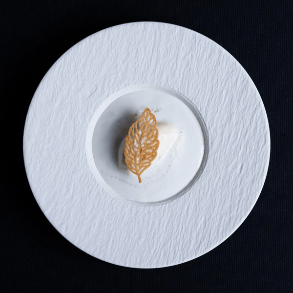
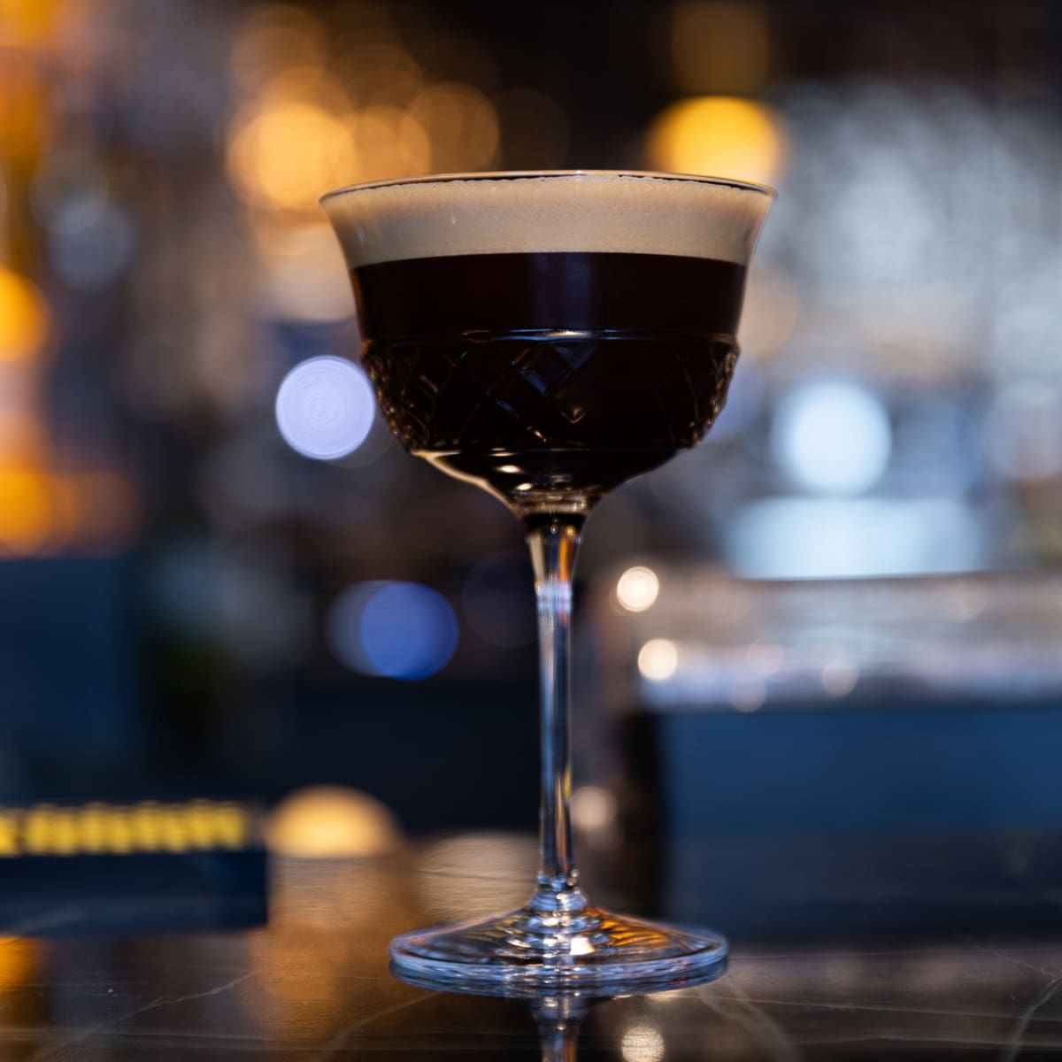
Whether you make a reservation on the website or walk into Sophias; After one click or step you will find yourself in the welcoming world of brass and royal blue. Online through the lush photography, offline through the interior that is rich in beautiful details. The restaurant has more than conquered its place in Leeuwarden.