TastyBasics TastyBasics: the tastiest without additions
You know how it is, less than an hour after a slice of bread topped with fruit sprinkles it starts to rumble again. Now you could of course opt for a quick snack or a grab the candy jar. Or you choose TastyBasics. A brand with a mission: to renovate the food offering in the supermarket through truly nutritious food. This ensures that everyone feels good, fit and healthy. Today and in the future. If we could help? Challenge accepted! From brand positioning to visual identity, web design and copy: our specialists ensured that no one can ignore TastyBasics.
Never change a winning team
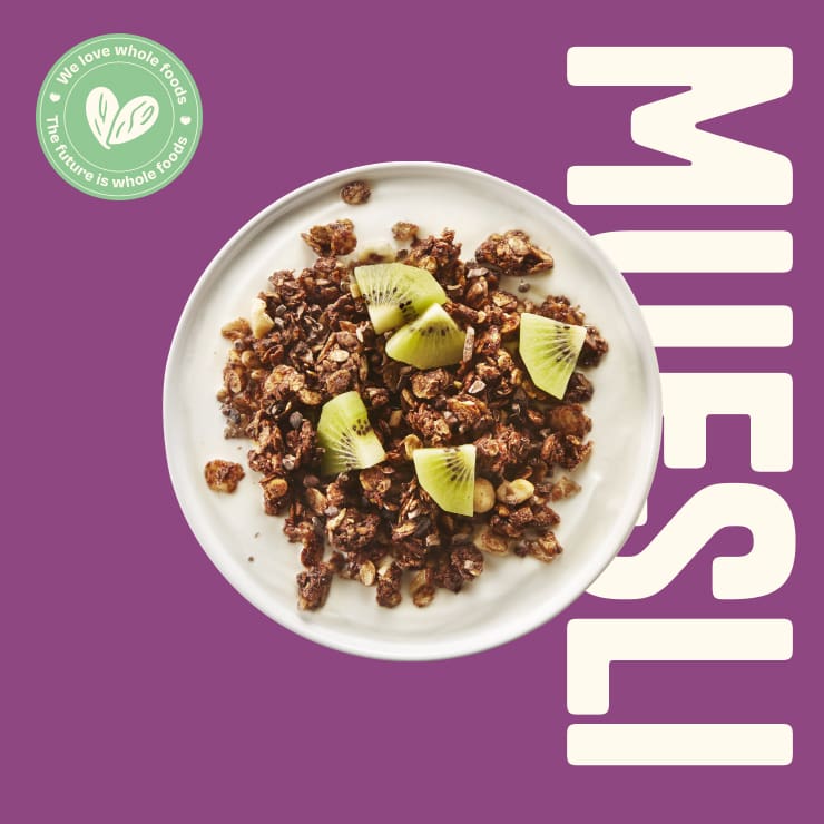
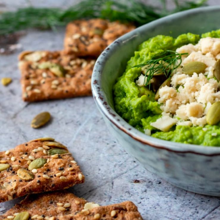
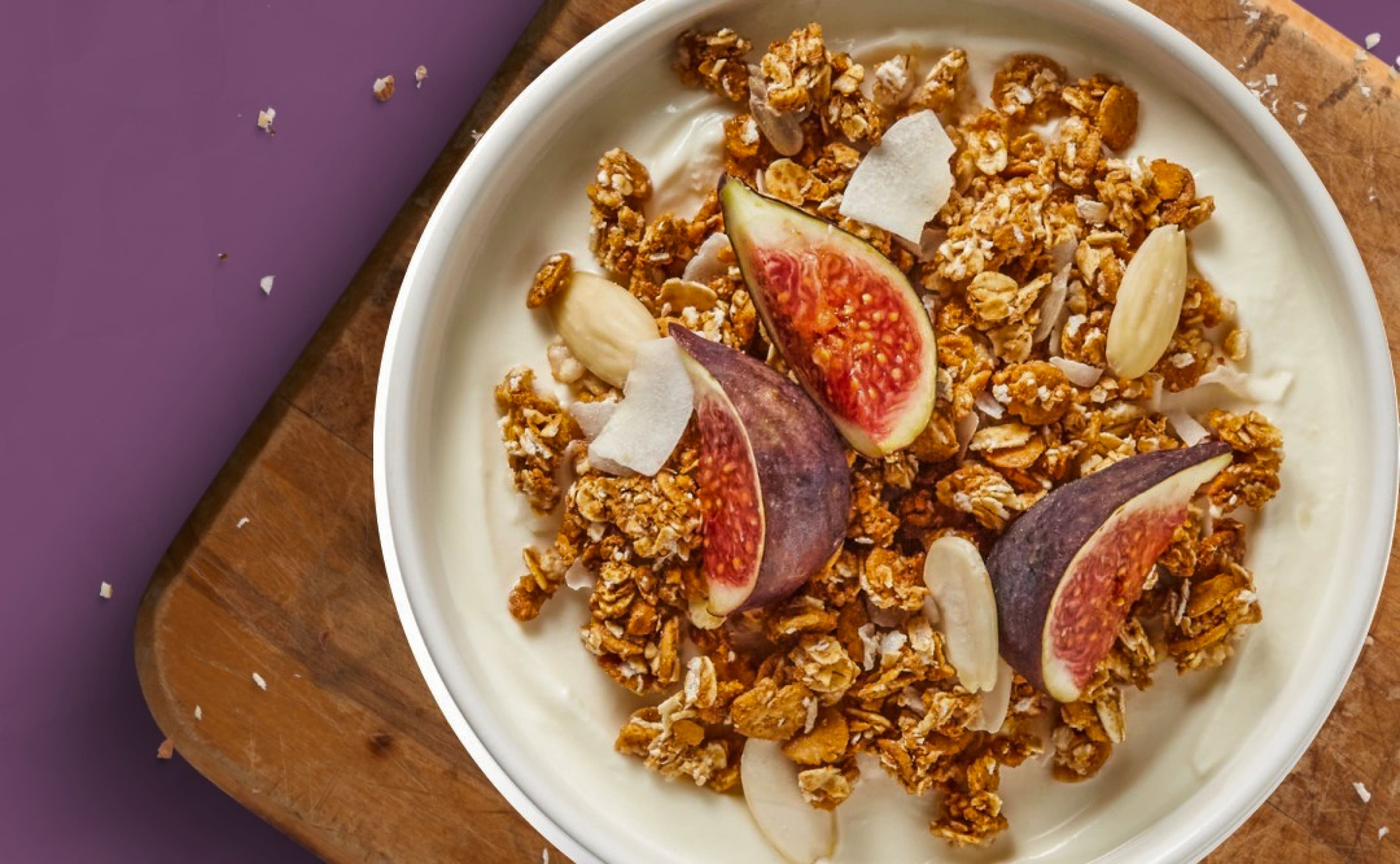
TastyBasics is anything but unknown to us. In fact, you could almost say we grew up together. Together we have already made our way from niche to mass. Now it was time for the next step: from follower to challenger brand. During a brand session we formulated new core values and sharpened the brand position of TastyBasics. Whole foods are central to the new positioning. By shifting the focus from fewer carbohydrates to more nature, TastyBasics taps into an even larger target group. In the new brand manifesto, we clicked all the puzzle pieces together and came up with a slogan that makes sense. TastyBasics is pure, real and honest. Without additives, but packed with fiber and proteins. In other words: TastyBasics, hands down the tastiest!
Stand out? No problem!
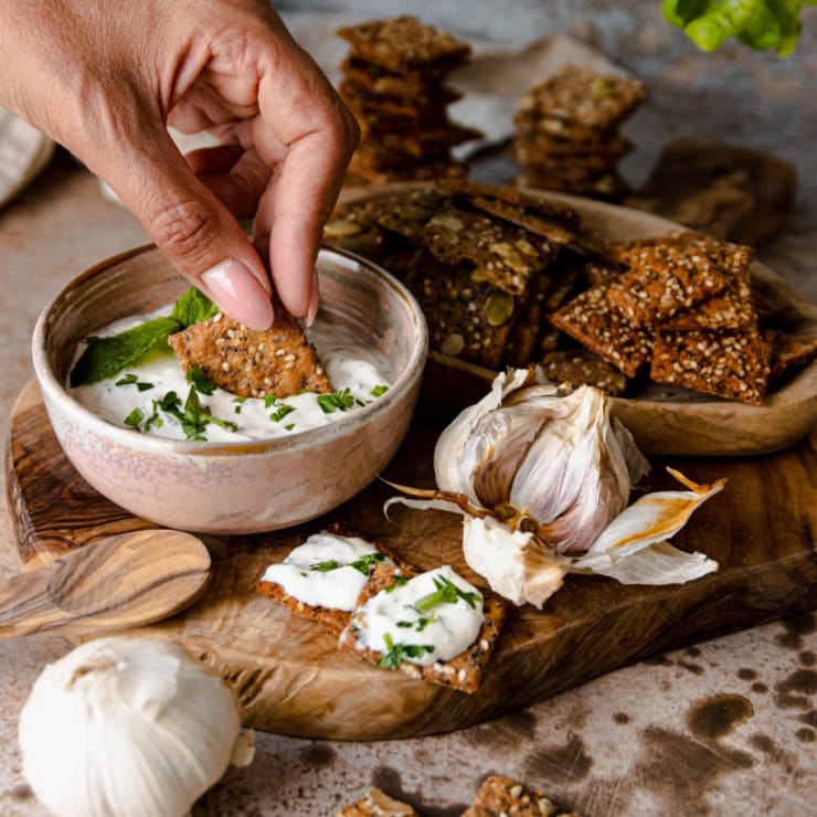
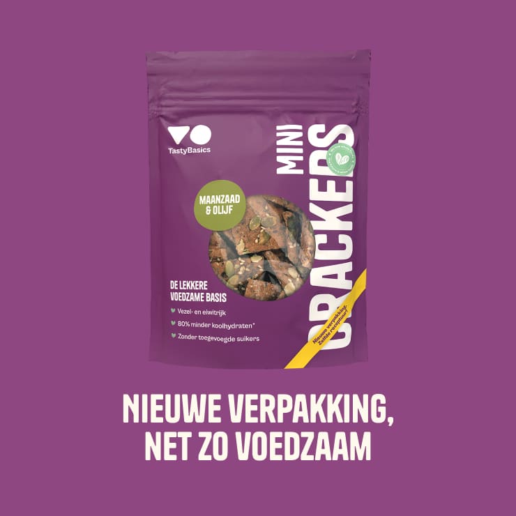
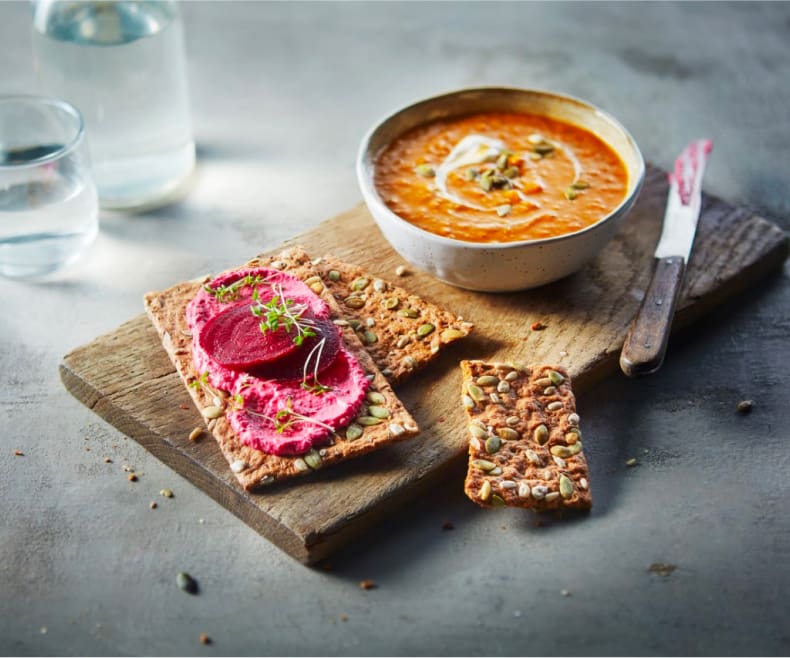
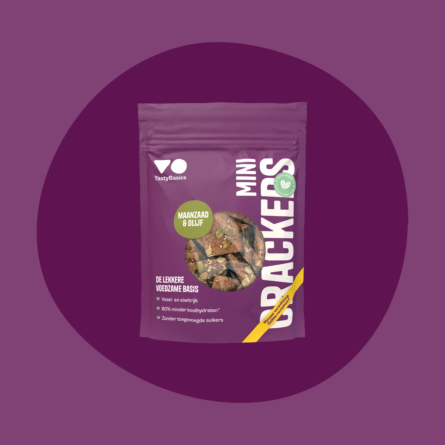
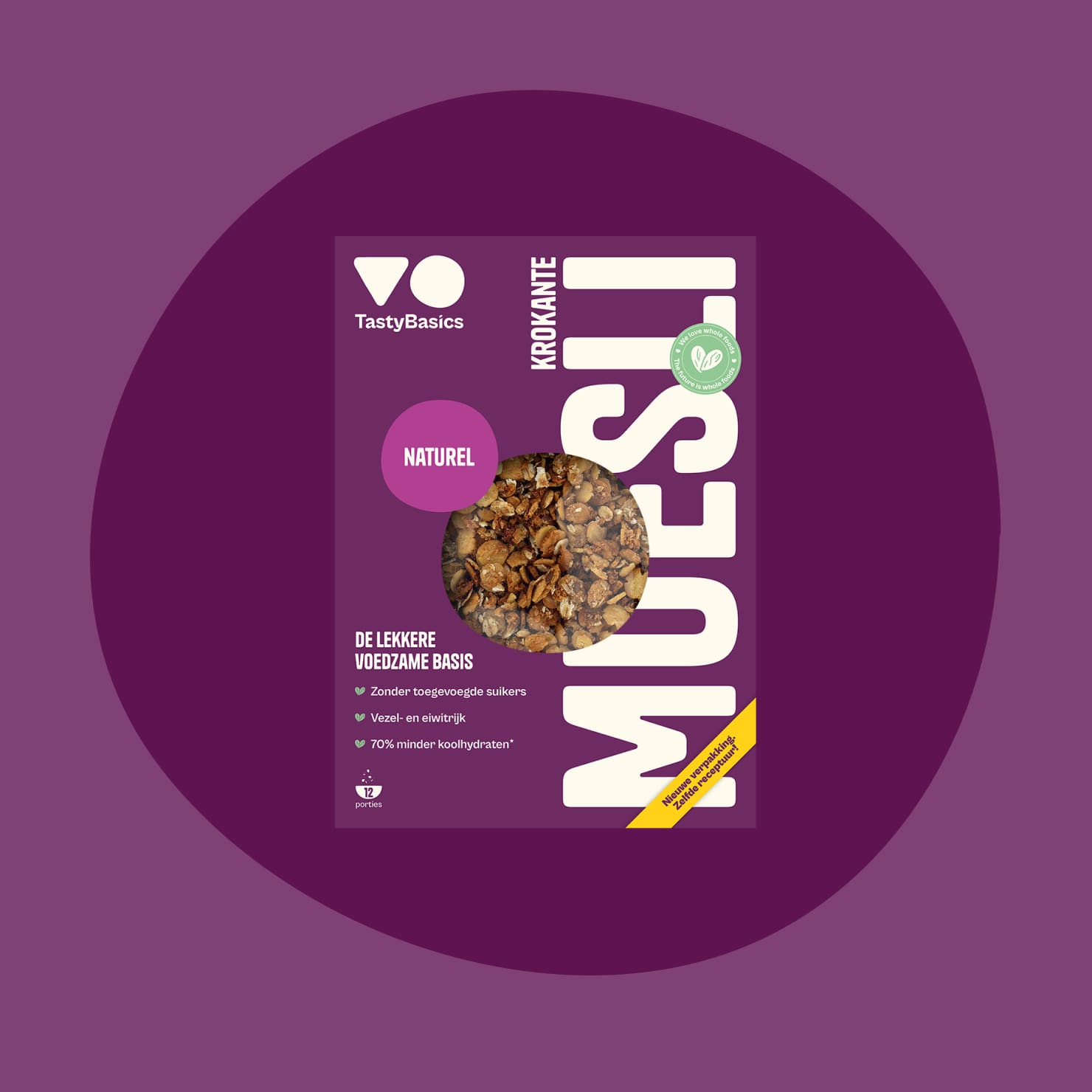
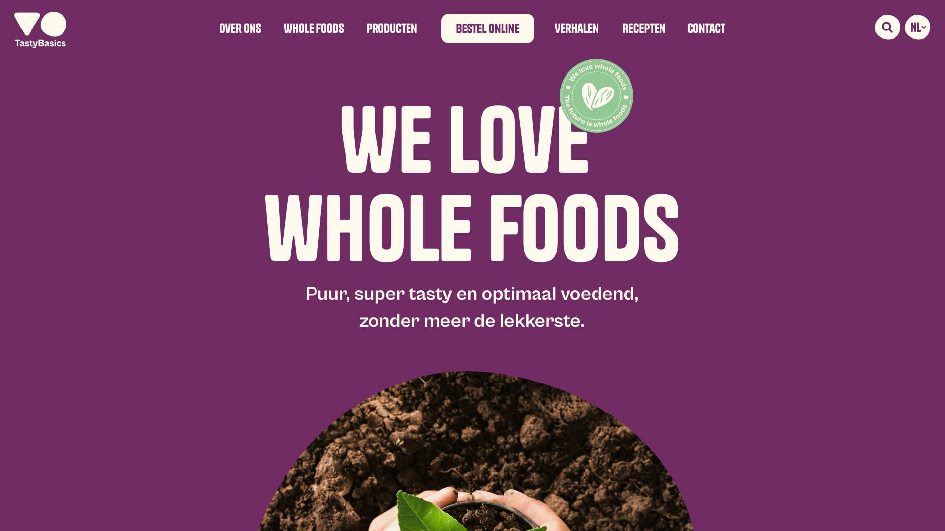
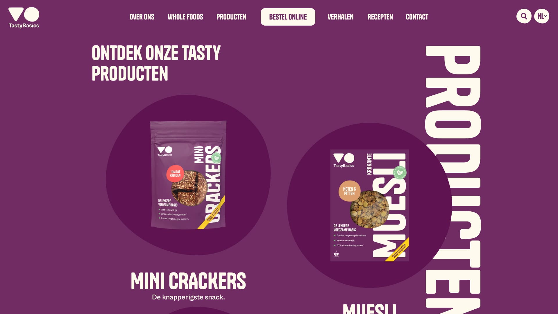
The packaging we designed for TastyBasics years ago gradually started to pinch. After all, a challenger role also requires a challenging appearance. The target? Stand out! Our designers modernized the logo and made a bold move by taking purple as the base color for the entire visual identity. A color that you won’t spot anywhere else on the shelves. The vertical positioning of the TastyBasics logo is extra striking. The ‘peepholes’ in the packaging and the stickers on the crackers and bread reveal what kind of tasty food you are getting. Nice and transparent!
A next level website
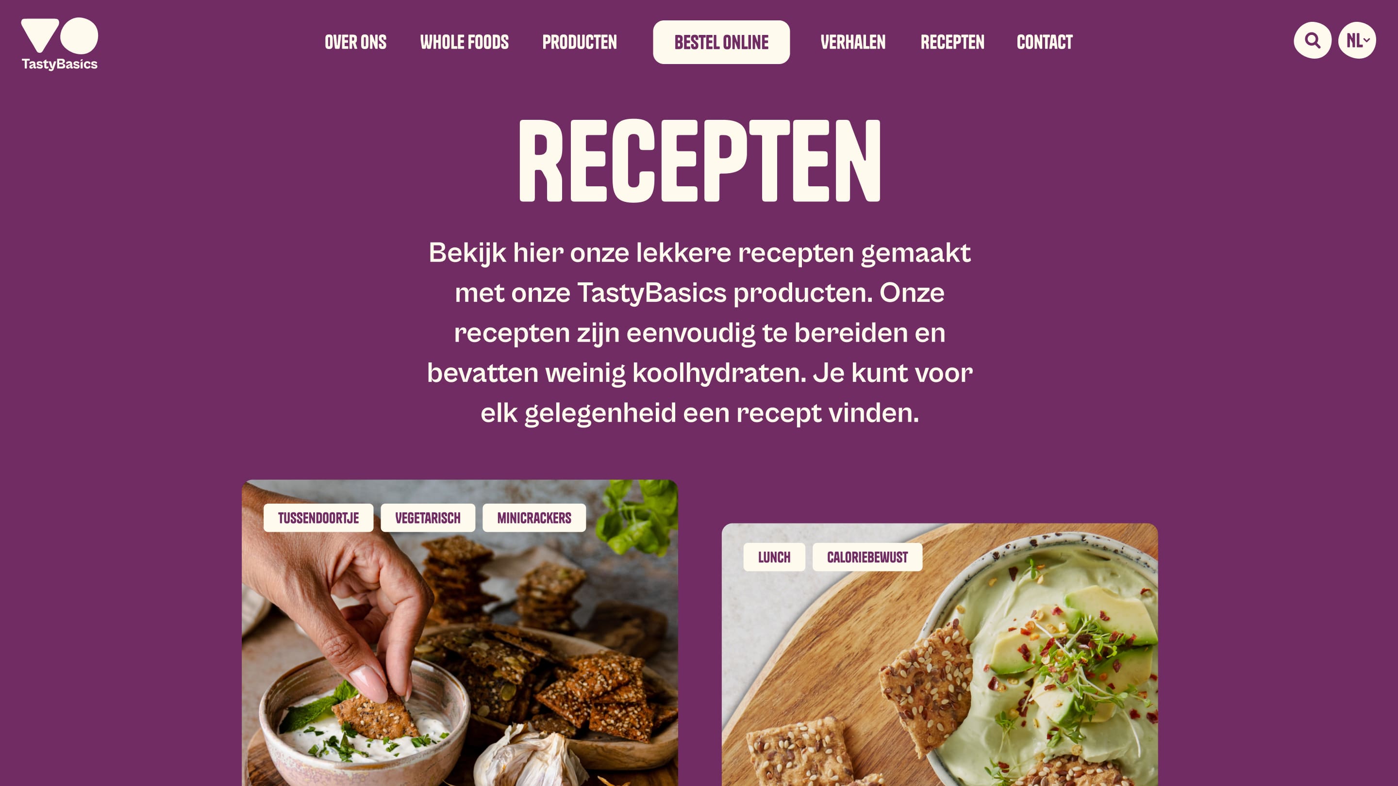
The new visual identity was implemented in a completely new and equally striking website. The theme of whole foods is also central here. With strong copy, in which extensive research has been translated into clear, accessible language, TastyBasics emphasizes that they do not just believe in whole foods, but that they know how important it is. Thanks to a multitude of flexible elements and striking colors, the website offers countless options for our colleagues at TastyBasics to share their story even better.
TastyBasics is everywhere
To convey TastyBasics’ mission and the new design to the general public, we came up with an extensive campaign plan. From radio commercials to YouTube videos, magazine advertisements and a social media strategy, we did everything we could to make sure that everyone knows (and tastes!) TastyBasics. Our own Juncies – previously stubbornly addicted to various forms of sweets – have already changed their minds. The candy jar is fuller than ever. Now it’s up to the rest of the Netherlands. But if you ask us, it’s only a matter of time.